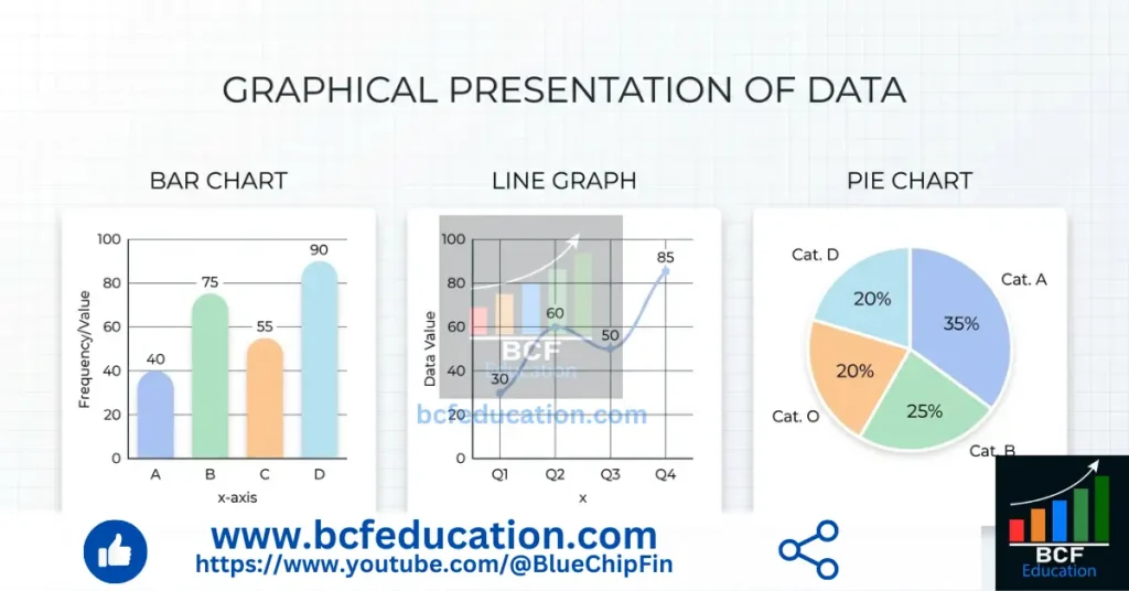
Graphical Presentation of the Data
This blog post on Graphical Presentation of the Data is designed to help students clearly understand how data can be visually represented for better interpretation and analysis. It provides a comprehensive collection of questions and their detailed answers related to various types of graphs, making it especially useful for exam preparation and conceptual clarity.
The blog covers fundamental concepts such as bar graphs, line graphs, pie charts, histograms, and frequency polygons. Each concept is explained through practical questions followed by step-by-step solutions, enabling readers to learn not only the theory but also its application. Emphasis is placed on accuracy, labeling, scaling, and proper presentation techniques, which are essential for effective data visualization.
In addition, the blog highlights the importance of graphical methods in simplifying complex data, identifying trends, and supporting decision-making in fields like economics, statistics, and business. Whether you are a beginner or an advanced learner, this post serves as a valuable resource to strengthen your understanding and improve your problem-solving skills related to graphical data representation.
Table of Contents
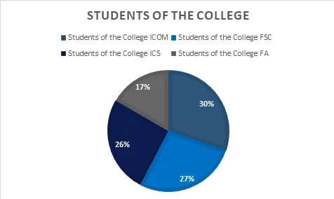
Define Pie Chart.
Answer:
A Pie Chart is a circular and sectoral diagram in which data is presented in to corresponding slices. It is suitable for the single variable which has multiple categories. Total Sectors are 360. Each category is presented through sector.
Example
| Students of the College | |||
| ICOM | FSC | ICS | FA |
| 100 | 90 | 85 | 55 |
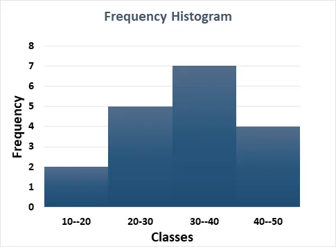
Define Histogram.
Answer:
A Histogram is a graphical representation of data using bars to show the frequency distribution of continuous data. Unlike a bar graph, the bars in a histogram touch each other, representing intervals (bins) of data values. It is used to analyze the shape, spread, and central tendency of data.
Example
| Classes | Frequency |
| 10–20 | 2 |
| 20-30 | 5 |
| 30–40 | 7 |
| 40–50 | 4 |
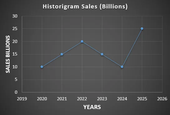
Define Historigram.
Answer: Historigram is a type of chart which is used to present the data of time series in which different variations of time series can be shown.It is also called graph of time series or historical series. In historigram, time is taken on x-axis and variable is taken on y-axis. Example is given below:
| Year | 2020 | 2021 | 2022 | 2023 | 2024 | 2025 |
| Sales (Billions) | 10 | 15 | 20 | 15 | 10 | 25 |
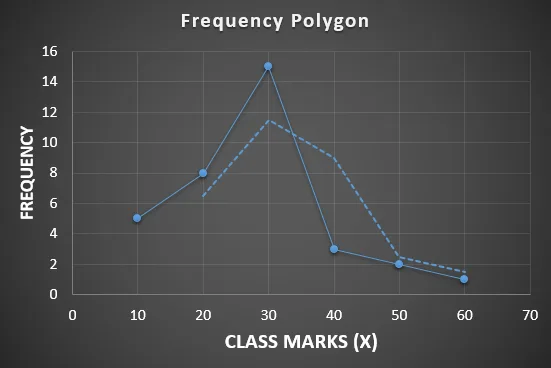
Define Frequency Polygon.
Answer: Frequency polygons are the type of graph which presents the frequency distribution. In frequency polygon, class marks are taken on x-axis and frequencies are taken on y-axis. After taking the data, dots are connected through line. Example of frequency polygon is given below:
| Class Mark (X) | 10 | 20 | 30 | 40 | 50 | 60 |
| Frequency | 5 | 8 | 15 | 3 | 2 | 1 |
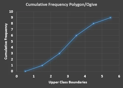
Define Cumulative Frequency Polygon or ogive.
Answer: Cumulative frequency polygon is a type of graph in which we present the cumulative frequencies in the graph. It is also called ogive. In ogive, upper limits of class boundaries are taken on x-axis and cumulative frequencies are taken on y-axis. Example of ogive or cumulative frequency polygon is given below:
| Class Boundaries | Frequency | Cumulative Frequency |
| 0.5–1.5 | 1 | 1 |
| 1.5–2.5 | 2 | 3 |
| 2.5–3.5 | 3 | 6 |
| 3.5–4.5 | 2 | 8 |
| 4.5–5.5 | 1 | 9 |
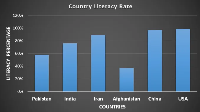
Define Rectangular Bar Chart.
Answer: A rectangular bar chart is a graphical representation of data using rectangular bars, where the length or height of each bar corresponds to the value it represents. It is commonly used to compare categories or track changes over time. Example of rectangular Bar Chart is given below:
| Country | Literacy Rate |
| Pakistan | 58% |
| India | 76% |
| Iran | 89% |
| Afghanistan | 37% |
| China | 97% |
| USA | 99% |
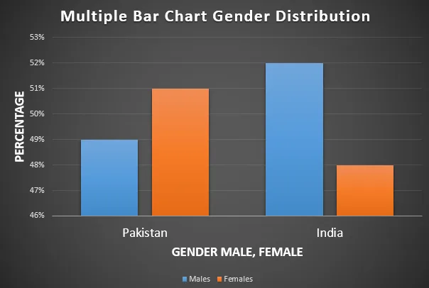
Define Multiple Bar Chart.
Answer:
Multiple Bar Charts are mostly used when there are multiple sub categories in a variable. In multiple bar charts, data is presented in rectangular bars. In multiple bar chart Percentage can be taken on y-axis and sub categories of the variable can be taken on x-axis. Example for multiple bar chart is given below:
| Gender Percentage | Pakistan | India |
| Males | 49% | 52% |
| Females | 51% | 48% |
Define Class Mark.
Answer: The midpoint of a class interval in a frequency distribution, calculated as the average of the lower and upper boundaries of the interval. It represents the central value of the class. It is denoted by (X)
Formula:
Define Class Boundaries.
Answer: Class boundaries are taken when upper and lower limits of classes are not equal. Class boundaries are important in the calculation of median, quartiles, deciles, percentiles and mode. First we take the difference of lower limit of second class and upper limit of first class and divide the result by 2. Final result should be subtracted from the lower limits and added to upper limits. The result is called class boundaries.
Define Classification and Tabulation.
Answer: The process of classifying data into groups is called classification whereas to present data in the form of table or to present into rows and columns is called tabulation.
Write down the important parts of table.
Answer:
- Title
- Box-Head
- Stub
- Body of data
- Prefatory Note
- Source Note
Define symmetrical distribution.
Answer:
Symmetrical distribution is a type of distribution in which Mean, Median and Mode all these three averages are equal. Symmetrical distribution makes perfect bell shaped curve. In symmetrical distribution there is no skewness or zero skewness.
Define asymmetric distribution.
Asymmetric distribution is a type of distribution in which Mean, Median and Mode all these three averages are not equal. Asymmetrical distribution makes imperfect bell shaped curve. In asymmetrical distribution there is skewness positive or negative.
Define skewness.
Answer: If distribution is asymmetric or when mean, median and mode are not equal then the distribution is asymmetric. Asymetric distribution is skewed distribution either positive or negative.
Positive Skewness
Mean > Median > Mode
Negative Skewness
Mean < Median < Mode
Define frequency distribution and size of class interval.
Answer: Frequency distribution is simply the actual occurring of a certain number of a certain number on number between ranges. Width of the class or difference of upper and lower class boundary is called class interval.
Write down the types of frequency distributions.
Answer:
- Univariate Frequency Distribution
- Relative Frequency Distribution
- Cumulative Frequency Distribution
- Percentage Frequency Distribution
- Bi-variate Frequency Distribution
Define relative frequency.
Answer: Relative frequencies are commonly used in calculation of probability. Each relative frequency can be calculated through division of individual frequency by sum of frequency. Sum of relative frequency is equals to 1.
Define Cumulative frequency.
Answer: Cumulative frequencies are used in the calculation of median, quartiles, deciles, percentiles and mode. Cumulative frequency is the running total of frequencies. Last cumulative frequency should be equal to the sum of frequency.
Define Bivariate frequency distribution.
Answer: Bivariate frequency distribution is a frequency distribution in which frequencies of two variables are recorded in the form of table. In contrast to univariate frequency distribution presents the frequency distribution of only one variable. In bivariate frequency distribution, contingency tables are used to display the distribution.