Statistics for Beginners: Your Complete Guide to Understanding Data Easy
Learning Statistics Let’s be honest for a second. When you hear the word “statistics,” what comes to mind? For many of us, it’s a flashback to a dusty classroom, a teacher scribbling incomprehensible formulas on a whiteboard, or a confusing graph in a news article that seems designed to make our eyes glaze over.
But here’s the thing: statistics isn’t really about the math. Not the complicated kind, anyway.
At its heart, statistics is about something much simpler and far more useful: making sense of the world. It’s the science of turning raw, confusing numbers into clear, actionable stories. Whether you’re trying to figure out if that new business idea will work, deciding which cell phone plan gives you the best value, or simply trying to understand if a headline is telling you the truth, statistics is your superpower.
This guide is written for absolute beginners. We’re going to strip away the jargon, avoid the scary formulas, and focus on the core ideas that will transform you from a person who is intimidated by data into someone who can use it to make better decisions.
What Exactly Is Statistics? (And Why Should You Care?)
In the simplest terms, statistics is the science of learning from data. It’s a set of tools and techniques for collecting, organizing, analyzing, interpreting, and presenting information.
Think of it like this: imagine a teacher with a stack of 100 exam papers. Without statistics, that teacher just has a pile of numbers some high, some low, a mess of information. But with statistics, that teacher can find the average score, see if most students struggled with a particular question, and create a graph that shows the overall performance of the class at a single glance. That’s the magic of statistics: it turns a pile of numbers into a clear picture.
This isn’t just for teachers. Statistics is the engine behind so much of our modern world:
- In Business: Companies use it to understand what customers want, to predict sales, and to decide where to open new stores.
- In Healthcare: Researchers rely on statistics to test if a new medicine is effective and to track the spread of diseases.
- In Government: Policymakers use population data (like the census) to decide where to build schools, hospitals, and roads.
- In Your Daily Life: The weather forecast, the polls you see during election season, and even the algorithm that recommends your next favorite show on Netflix all of them are powered by statistics.
Without it, we’d be making decisions based on guesswork, gut feelings, and anecdotes. With it, we can base our choices on evidence. And in a world overflowing with information, that’s a skill worth having.
The Two Main Branches: Descriptive vs. Inferential
Before we dive into any specific terms, it’s essential to understand that statistics is built on two core pillars. Getting a handle on these two concepts will make everything else fall into place.
Pillar 1: Descriptive Statistics (Describing What You Have)
Imagine you just got back from a trip and you have a pile of 500 photos. Descriptive statistics is the process of sorting those photos into albums, picking the best ones to show your friends, and creating a summary of your trip.
In the world of data, descriptive statistics is about summarizing and describing the information you have right in front of you. Its goal is to make the data easy to understand.
It does this using three main tools:
- Measures of Central Tendency: This is just a fancy term for finding the “typical” or “average” value. You’ll often hear about the mean (the simple average), the median (the middle value), and the mode (the most frequent value).
- Measures of Spread: This tells you how much the data varies. Are all the numbers clustered closely together, or are they all over the map? Think of the range and the standard deviation.
- Visualizations: These are the charts and graphs like bar charts, pie charts, and line graphs that help us see patterns and trends at a glance.
Descriptive statistics answers the simple question: “What does the data show?”
Pillar 2: Inferential Statistics (Making Predictions)
Now, imagine you want to know how everyone in your entire country feels about a new law. You can’t possibly ask every single person. So, you ask a smaller, carefully selected group of 1,000 people. Based on their answers, you make an educated guess about how the whole country feels.
That’s inferential statistics in a nutshell. It’s the art of using data from a sample (a small group) to draw conclusions and make predictions about a population (a much larger group).
This is incredibly powerful. We use inferential statistics every day, often without realizing it:
- Pollsters survey a few thousand voters to predict the outcome of a national election.
- Scientists test a new drug on a few hundred patients to determine if it’s safe and effective for millions.
- Quality control inspectors test a small batch of products to ensure the entire factory’s output is up to standard.
Inferential statistics answers the more ambitious question: “What can we conclude or predict about the bigger picture?”
The Language of Statistics: Key Terms to Know
To feel comfortable with statistics, you need to know its basic vocabulary. Think of these as your new data-savvy words.
Population vs. Sample
- Population: The entire group you want to learn about. It’s the big picture. (e.g., All the voters in the United States.)
- Sample: A smaller, manageable group taken from the population. It’s your window into the big picture. (e.g., 1,200 voters randomly selected to be polled.)
The magic and the challenge of statistics is using a sample to accurately understand the population. If your sample is biased (for example, only polling people at a gym about their exercise habits), your conclusions about the wider population will be wrong.
Parameter vs. Statistic
This is a subtle but crucial distinction:
- A parameter is a number that describes a population. For example, the actual average age of everyone in Canada. This is almost always unknown because it’s too big to measure.
- A statistic is a number that describes a sample. For example, the average age of the 500 Canadians you surveyed.
- The Connection: We use a statistic (from our sample) to estimate a parameter (about the population).
Variables: The What of Your Data
A variable is simply any characteristic that can change or vary from person to person, place to place, or thing to thing. They are the columns in your spreadsheet. There are two main types:
- Quantitative (Numerical) Variables: These represent amounts or counts. You can do math with them.
- Discrete: These are counts, usually whole numbers. (e.g., Number of children, number of cars.)
- Continuous: These can be any value along a scale. (e.g., Height, weight, temperature, time.)
- Categorical (Qualitative) Variables: These represent categories or groups. You can’t average them.
- Nominal: Categories with no natural order. (e.g., Eye color, country of birth, favorite genre of music.)
- Ordinal: Categories with a natural, logical order. (e.g., Customer satisfaction rating: unsatisfied, neutral, satisfied.)
Getting to Know Your Data: Descriptive Stats in Action
Now let’s put some of these ideas to work. This is where most beginners start: summarizing data.
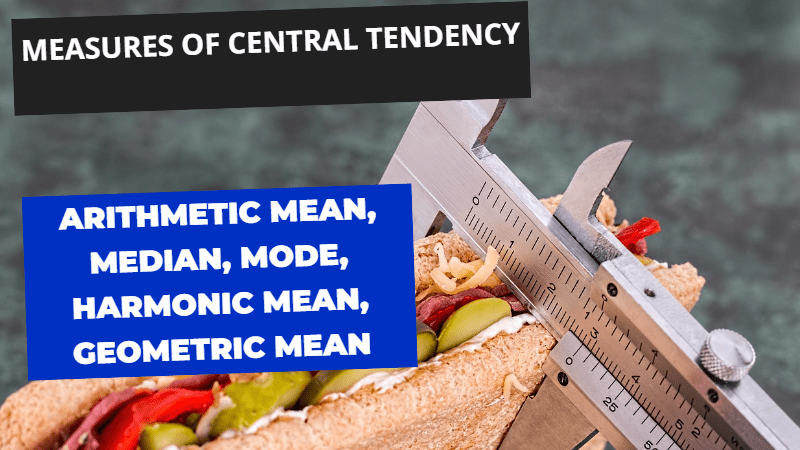
Finding the Center: Mean, Median, and Mode
When someone asks, “What’s the average?” they are usually asking about the center of the data. But which “average” is the right one? It depends.
- The Mean (The Simple Average): This is what most of us think of as “the average.” You calculate it by adding up all the values and dividing by the number of values.
- Example: The mean of 2, 4, and 9 is (2+4+9)/3 = 5.
- The Catch: The mean is easily fooled by outliers those extreme values that are much higher or lower than the rest. Imagine a neighborhood with incomes of $50k, $55k, and $1,000k. The mean income is $368k, which doesn’t represent anyone in the neighborhood. That’s the mean’s big weakness.
- The Median (The Middle Value): This is the true middle ground. You find it by ordering all your data from smallest to largest and picking the one in the middle.
- Example: In the income set $50k, $55k, and $1,000k, the median is $55k.
- Why It’s Powerful: The median is resistant to outliers. It gives you a much more realistic picture of a “typical” value when your data is skewed or has extreme values. For things like income, house prices, or any data that can have a few extremely high numbers, the median is often your best friend.
- The Mode (The Most Frequent): This is simply the value that appears most often in your dataset.
- Example: In the set [2, 3, 3, 5, 7], the mode is 3.
- When to Use It: The mode is the only measure of center you can use for categorical data. If you want to know the most popular ice cream flavor or the most common answer in a survey, the mode is what you’re looking for.
Seeing the Spread: Beyond the Average
Knowing the center of your data is only half the story. You also need to know how spread out it is. Two classes can have the same average test score, but one class might have everyone scoring around 85%, while the other class has a mix of geniuses (100%) and students who really struggled (70%). The average alone hides that truth. This is where measures of spread come in.
- Range: The simplest measure. It’s just the difference between the highest and lowest values.
- Example: If the highest test score is 98 and the lowest is 58, the range is 40.
- The Catch: The range only uses two numbers the extremes so it tells you nothing about the scores in between.
- Standard Deviation (The Real MVP): This is the most important measure of spread. In plain English, the standard deviation tells you the average distance of every data point from the mean.
- A small standard deviation means most of the data points are clustered tightly around the mean. The class is consistent.
- A large standard deviation means the data points are spread out over a wider range. The class is inconsistent.
Think of it like two archers. Both have an average score of 8 (same mean). One archer’s arrows all hit the 7, 8, and 9 rings. That’s a small standard deviation they are consistent. The other archer hits the 1, 5, and 10 rings. That’s a large standard deviation they are wildly inconsistent. The standard deviation tells you about reliability and risk.
A Picture is Worth a Thousand Data Points
Never underestimate the power of a good graph. Visualizations are often the best way to explore your data and communicate your findings to others.
- Bar Charts: Perfect for showing counts of categorical data. How many people like vanilla vs. chocolate? A bar chart makes it clear.
- Histograms: These look like bar charts but are used for quantitative data. They group numbers into “bins” (like ages 0-10, 11-20, etc.) to show the shape of your data’s distribution. Is it a nice, symmetric bell curve? Is it skewed to one side? A histogram reveals it.
- Scatter Plots: Used to explore the relationship between two quantitative variables. Plotting hours studied against exam scores on a scatter plot can instantly show you if there’s a pattern—do more study hours tend to lead to higher scores?
Stepping into Inference: From Sample to Population
Once you’re comfortable with describing data, you can step into the truly powerful world of inference. This is where we use the data we have to make educated guesses about what we don’t have.
Probability: The Language of Uncertainty
At the core of inferential statistics is probability. Probability is simply a measure of how likely something is to happen. It’s a number between 0 (impossible) and 1 (certain). When a weather forecaster says there’s a “70% chance of rain,” they are speaking the language of probability. When a statistician talks about a “95% confidence interval,” they are doing the same.
Key Tools of Inference
- Confidence Intervals (The Range of Possibilities): Instead of giving a single, risky guess, a confidence interval provides a range of plausible values. It’s a way of expressing uncertainty.
- Example: A pollster doesn’t just say, “Candidate A will get 52% of the vote.” They say, “We are 95% confident that Candidate A will get between 49% and 55% of the vote.” This range is a confidence interval. It acknowledges that because they only surveyed a sample, there’s a margin of error. It’s a more honest and realistic way to present findings.
- Hypothesis Testing (The Scientific Method for Data): This is a structured process for using data to test a claim.
- You start with two ideas:
- The Null Hypothesis ($H_0$): This is the default assumption of “no effect” or “no difference.” (e.g., “This new website design has no effect on sales.”)
- The Alternative Hypothesis ($H_A$): This is what you’re trying to prove. (e.g., “The new website design increases sales.”)
- You then collect your data and calculate a p-value. The p-value is the probability of getting the results you did if the null hypothesis were true (i.e., if the new design actually had no effect).
- If the p-value is very small (usually less than 0.05, or 5%), it means your data would be very unlikely to happen by random chance alone. So, you have evidence to reject the null hypothesis and conclude that your new website design likely does have an effect.
- You start with two ideas:
Common Pitfalls: How to Avoid Being Misled
Statistics is a powerful tool, but like any tool, it can be misused either accidentally or on purpose. As you become more data-literate, watch out for these common traps.
- Correlation Does Not Equal Causation: This is the golden rule of statistics. Just because two things are related (they correlate) does not mean one causes the other. For example, ice cream sales and drowning incidents both increase in the summer. Does that mean eating ice cream causes drowning? No. The hidden, or “lurking,” variable is temperature. Hot weather causes both ice cream sales and swimming (and therefore drowning) to increase. Always ask: “Is there a third factor at play?”
- Bias in Samples: A conclusion is only as good as the data it’s based on. If you want to know the opinion of your entire school, but you only survey your friends, your sample is biased. Be wary of polls that are “voluntary response” (like online polls, which attract people with strong opinions) or “convenience samples.”
- Misleading Visuals: Graphs can lie. Always check the axes. A bar chart that doesn’t start the y-axis at zero can make a small difference look like a massive change. A responsible graph will always show the full picture.
- Ignoring Variability: When someone tells you an average, always ask, “What’s the spread?” A mean of 50% could mean everyone scored exactly 50%, or it could mean half the class scored 100% and the other half scored 0%. The average alone doesn’t tell you which scenario is true.
Your First Steps: How to Start Learning Statistics
You don’t need to be a math whiz to get started with statistics. You just need curiosity and a willingness to practice.
- Start with the Basics: Don’t try to learn everything at once. Focus on the concepts we’ve covered here: mean vs. median, standard deviation, and the difference between descriptive and inferential statistics.
- Practice with Real Data: The best way to learn is by doing. Use data that matters to you. Track your daily steps, analyze your monthly spending, or compare the performance of your favorite sports team over a season. Use a spreadsheet like Excel or Google Sheets to calculate the mean, median, and standard deviation.
- Embrace Visualization: Before you calculate anything, make a graph. Plot your data as a histogram. Create a scatter plot. Visualizing your data will often reveal patterns and outliers that you wouldn’t see just by looking at a list of numbers.
- Ask Good Questions: The most important statistical skill isn’t calculation it’s questioning. When you see a statistic, ask: Who was in the sample? How big was it? What’s the margin of error? Is this a correlation or a causation? These questions will protect you from being misled.
Conclusion: The Story Behind the Numbers
Statistics is so much more than a branch of mathematics. It’s a way of thinking. It’s a framework for making better decisions in the face of uncertainty. It’s a skill that empowers you to cut through the noise, evaluate claims with a critical eye, and uncover the real story hiding behind the data.
By learning the basics understanding the two pillars, mastering the key vocabulary, and knowing how to summarize and visualize data you are building a foundation for critical thinking that will serve you for a lifetime.
You don’t have to become a professional data scientist to benefit from this knowledge. You just have to start. Begin by asking better questions about the numbers you see every day. Practice with simple tools. And remember: at its core, statistics isn’t about the numbers themselves ,it’s about understanding the world, and our place in it, a little bit more clearly.